Project Navy Blue: Part 1
Project Navy Blue sits in a historic downtown Memphis neighborhood and quickly turned into my favorite project to date. My clients contacted me in March 2023, and we set up a discovery call. After our discovery call, we knew almost immediately that this was going to be a great partnership. During the consultation we walked and talked about each room, and their vision for the project. They even had a PPT presentation to walk me through what their previous home looked like and some items that they would potentially like to use in the design.
Upon entering the home, I immediately knew some of the changes that I wanted to make, and I was excited to get started. This home was much smaller than my clients previous homes, and they need storage to house some of their belongings. We discussed in detail that built in shelves were needed in the family room and in the parlor room. I knew that James Daniels of Pros Contracting would be ideal as the general contractor for this project. I also knew that Kristin Owens of Humbled Kreations & Dustin Adkins of Adkins Woodworking would be great teammates for the custom built ins and for custom cabinet doors and drawers for the kitchen.
Once we had the team all set and on board, we meet a few times to go over the plans for the project. After James assembled his team of expert tradesmen, we were all set to begin.
Before we dive into the room transformations, let’s check out what I saw the first day I walked in.
The Before
The open floor plan consists of the kitchen and family room. From this view you can see the book shelve that was preexisting and the arch doorway.
The kitchen had a very traditional style to it with these fish scale backsplash.
This blank wall is where the oversized custom built-ins will be. Trust me, it will be a major transformation.
This primary bedroom had all the potential in the world. This before pic is so far from what it looks like today. Keep scrolling and see what I mean.
As you can see, nothing but the home’s layout could stay the same.
The After
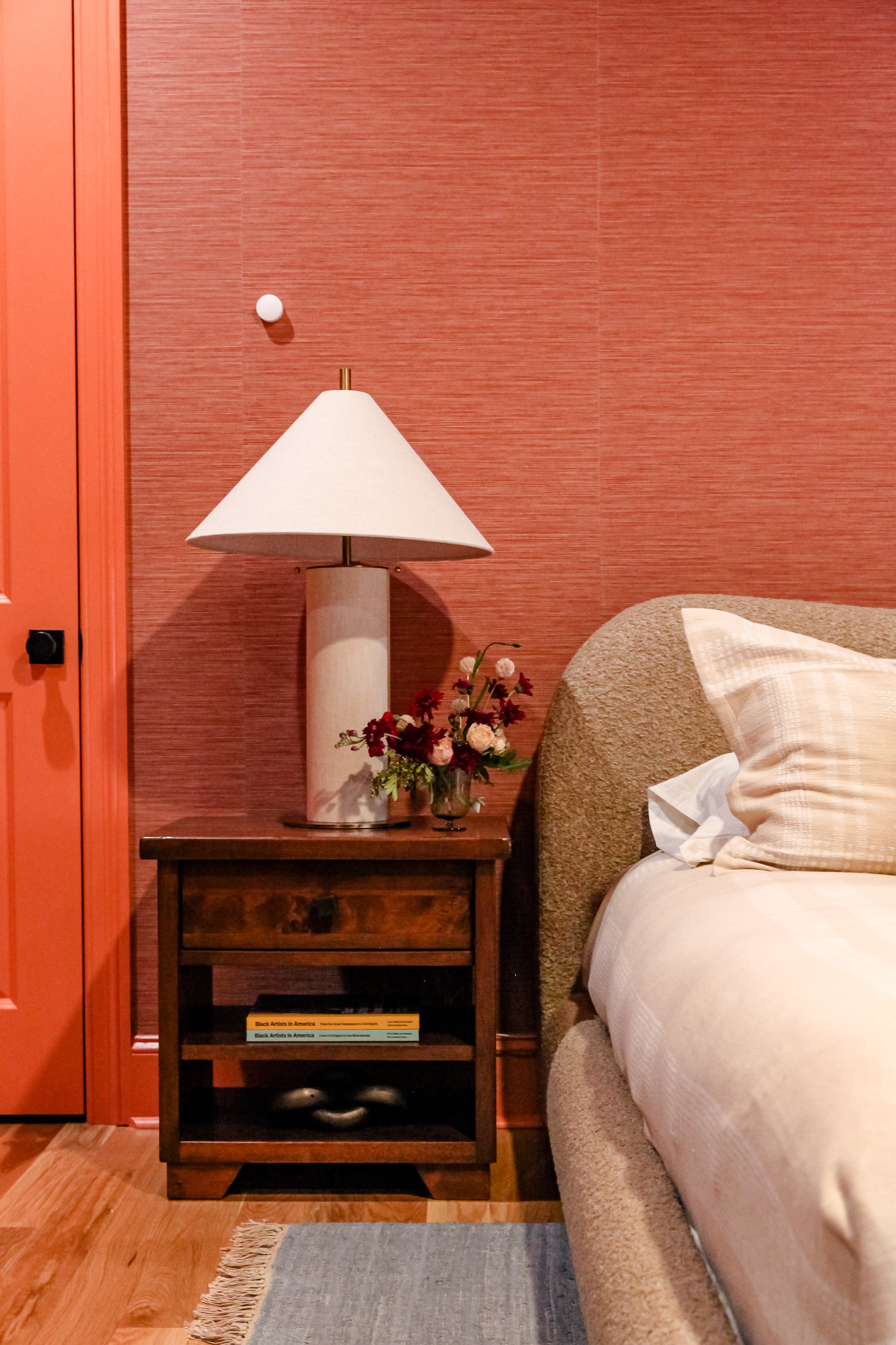
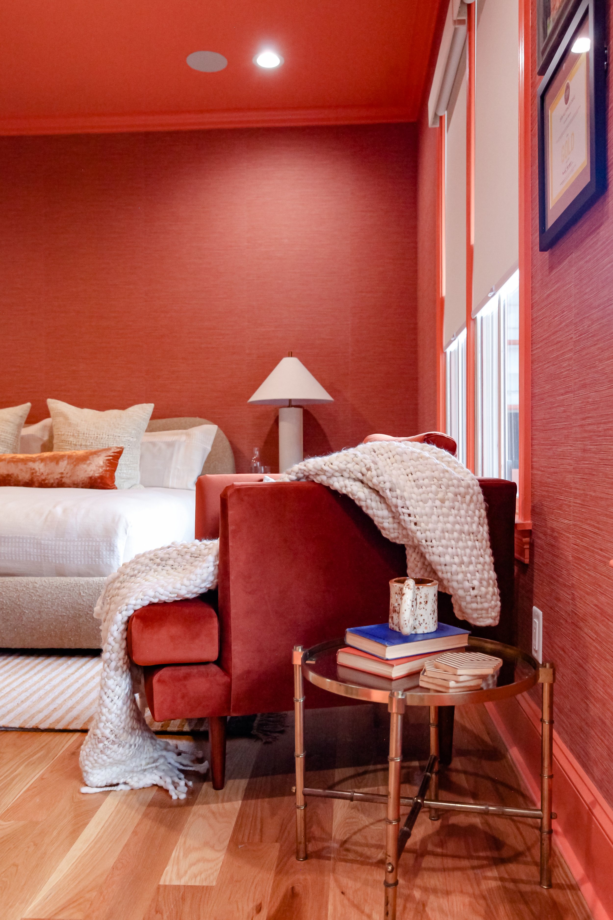
In the primary bedroom, I wanted this space to feel warm and cozy. The first thing we did was took up the carpet and laid white oak hardwood flooring. We then had it expertly buffed and treated so the entire home matched. We wrapped this room in this beautiful textured wallpaper that immediately make you want to come curl up in this space. We took the color from the wallpaper and covered the ceiling and the trim with it. This makes the room feel cohesive and doesn’t break up the eye.
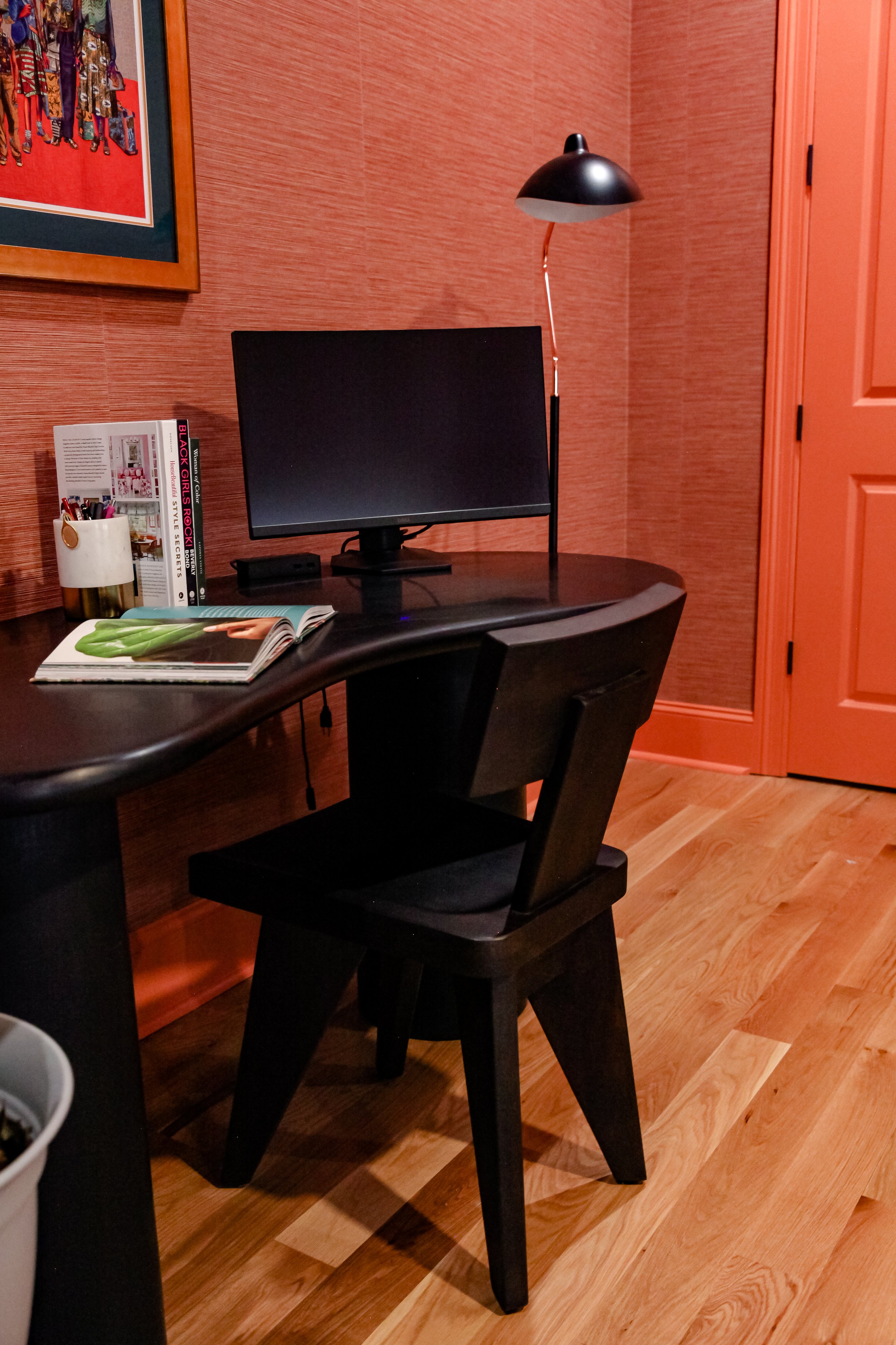
My client often works from home, but there wasn’t a designated room for an office. Therefore, we created one in the primary bedroom. I wanted to make sure the desk and chair was sleek and beautiful so that it added to the room and wasn’t distracting.
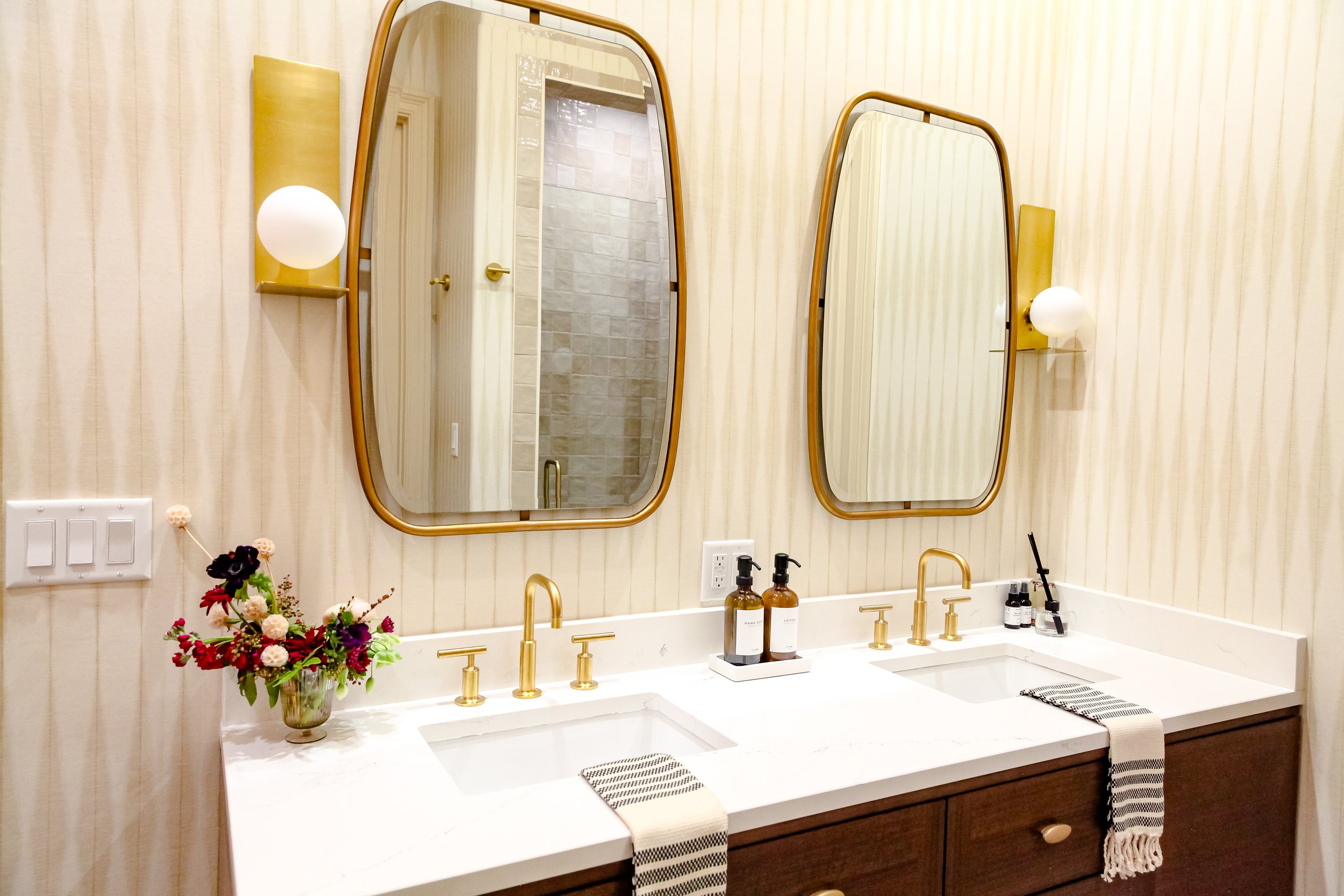
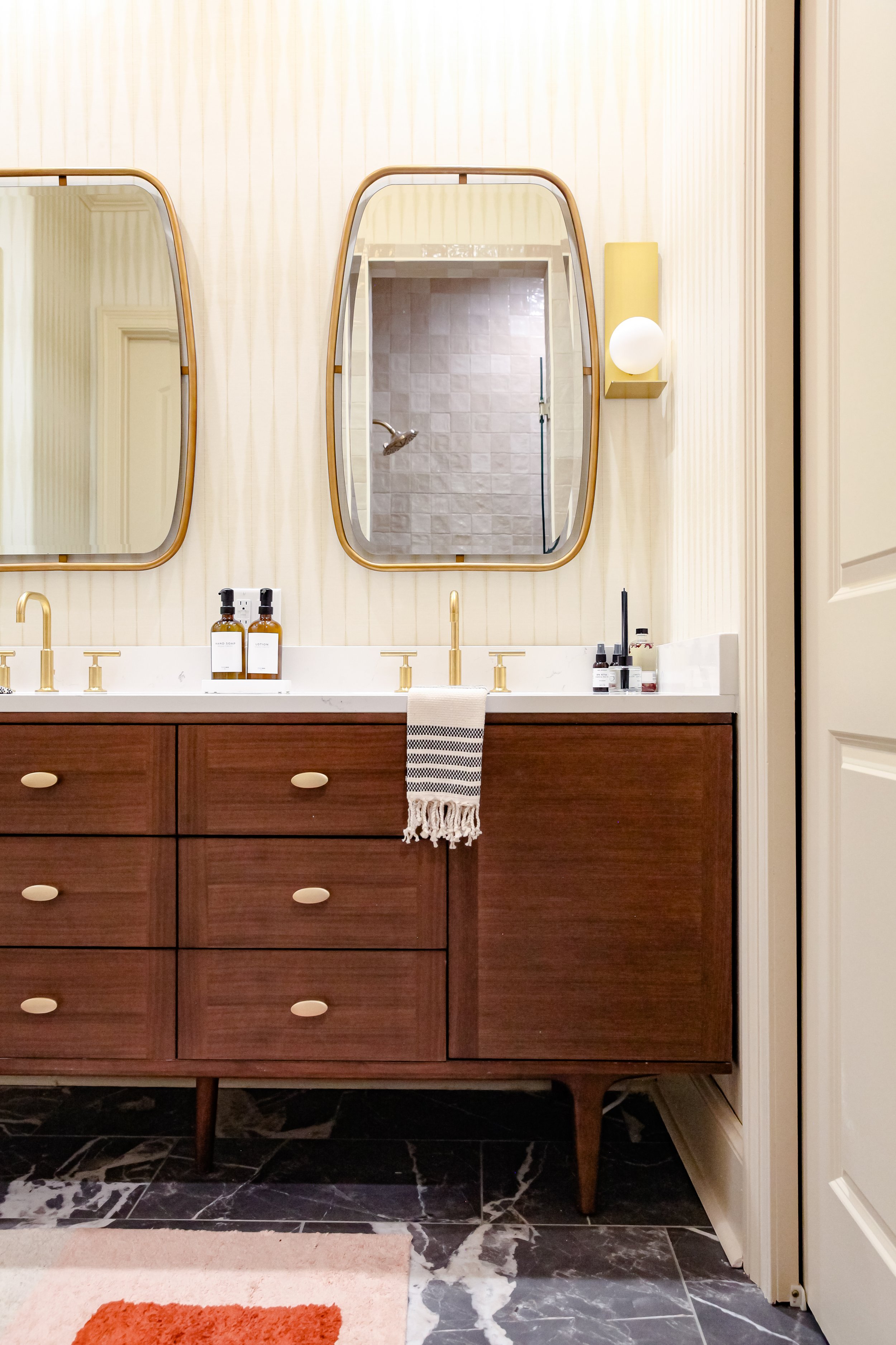
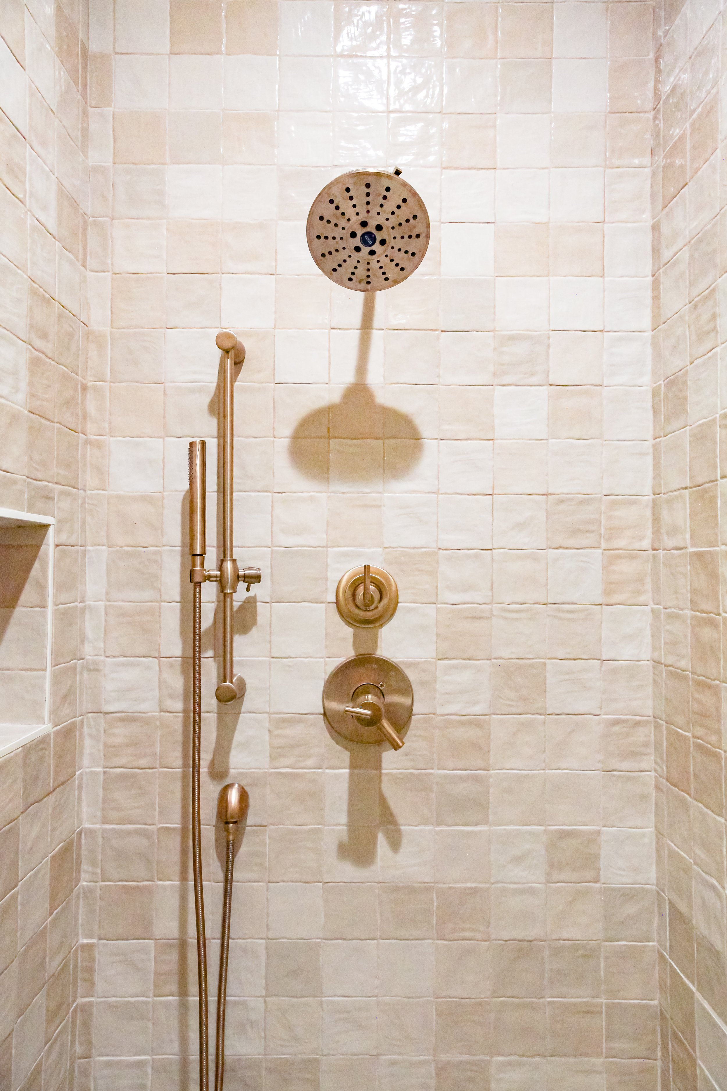
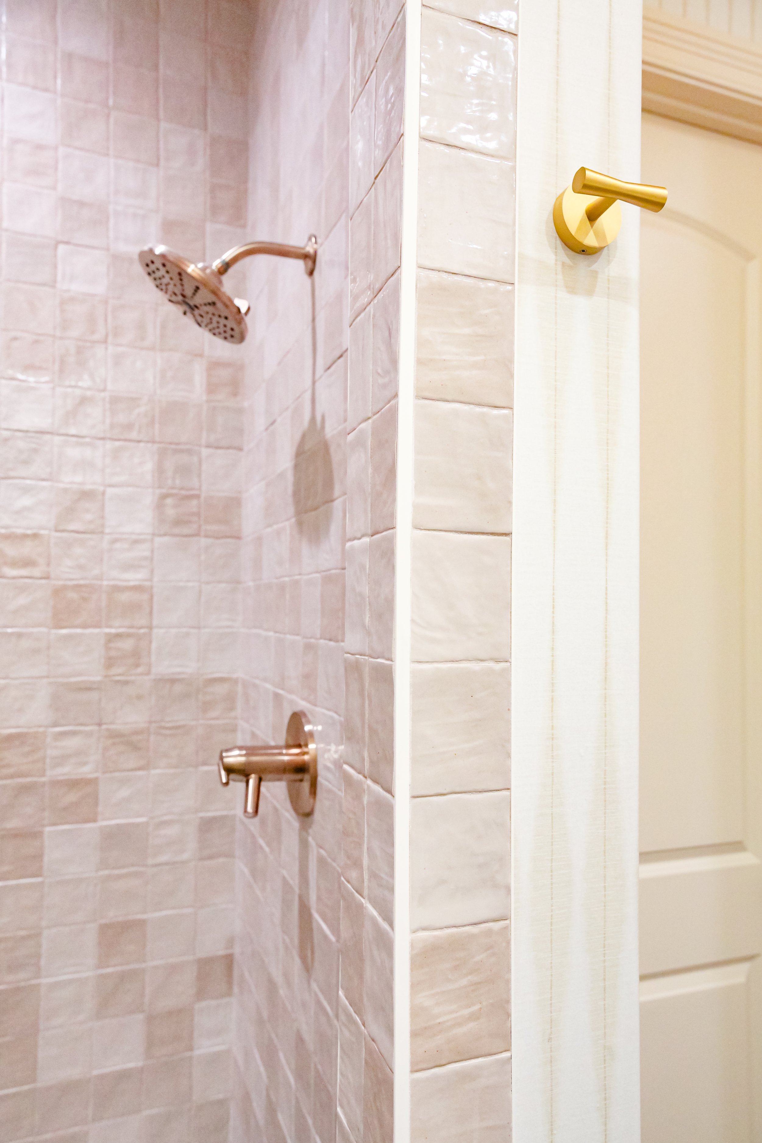
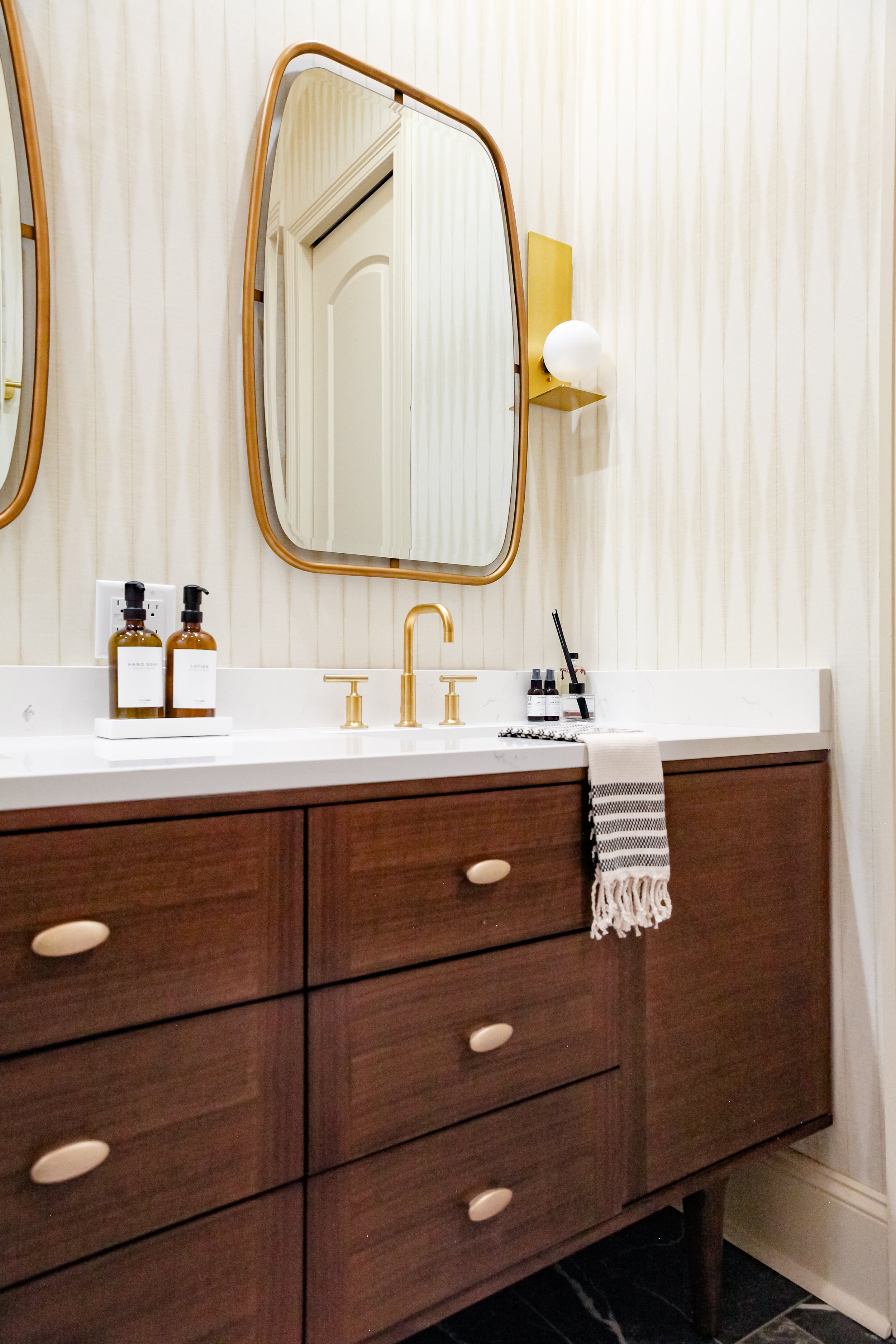
There are so many elements in the Primary bathroom that simply make you stop and take notice. This space is bright and warm with pops of brass and has patterned wallpaper. We painted the trim and doors to match the wallpaper for a seamless transition.
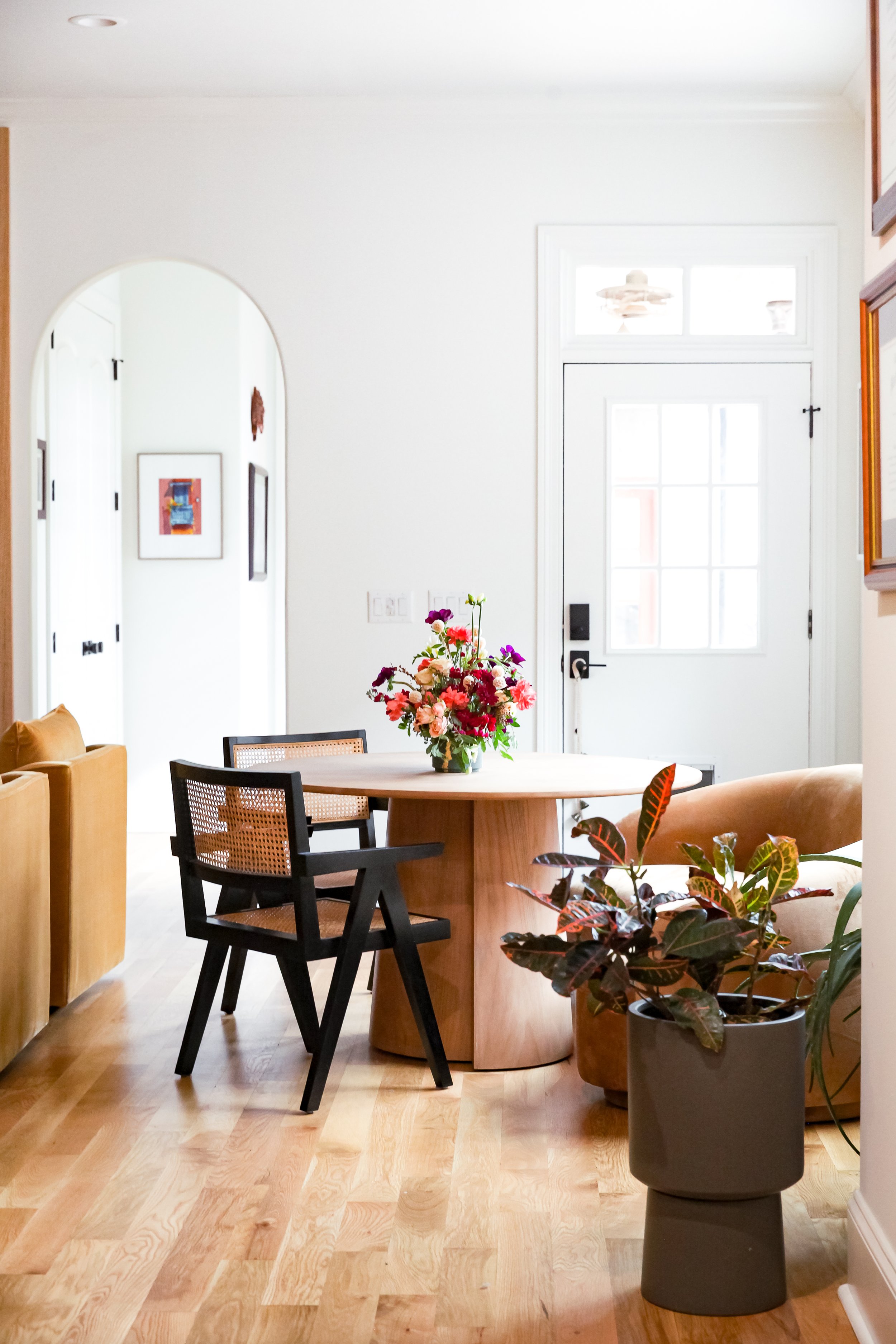
My clients needed an area besides their dining room to sit and eat. So in their family room, I was able to create a small breakfast nook where the family can gather and have breakfast, lunch, or dinner together. I chose this beautiful textured curved couch with the circle table to play up the arches in the doorways and custom built-ins. It also allowed an additional visual shape in the space.
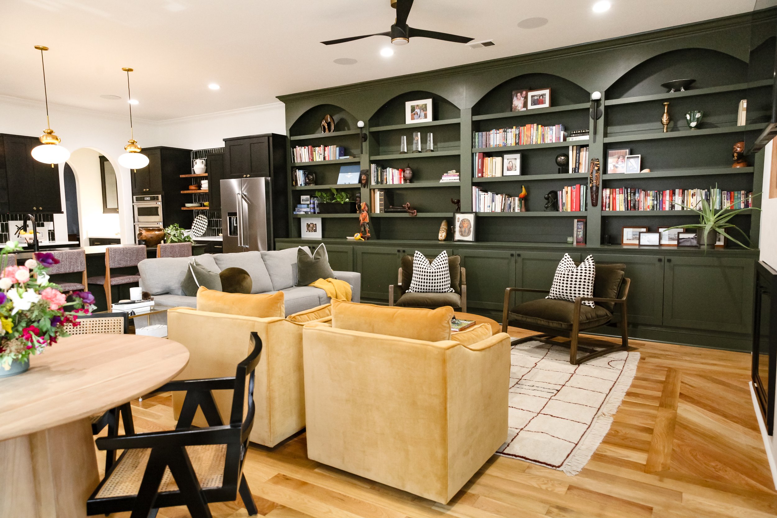
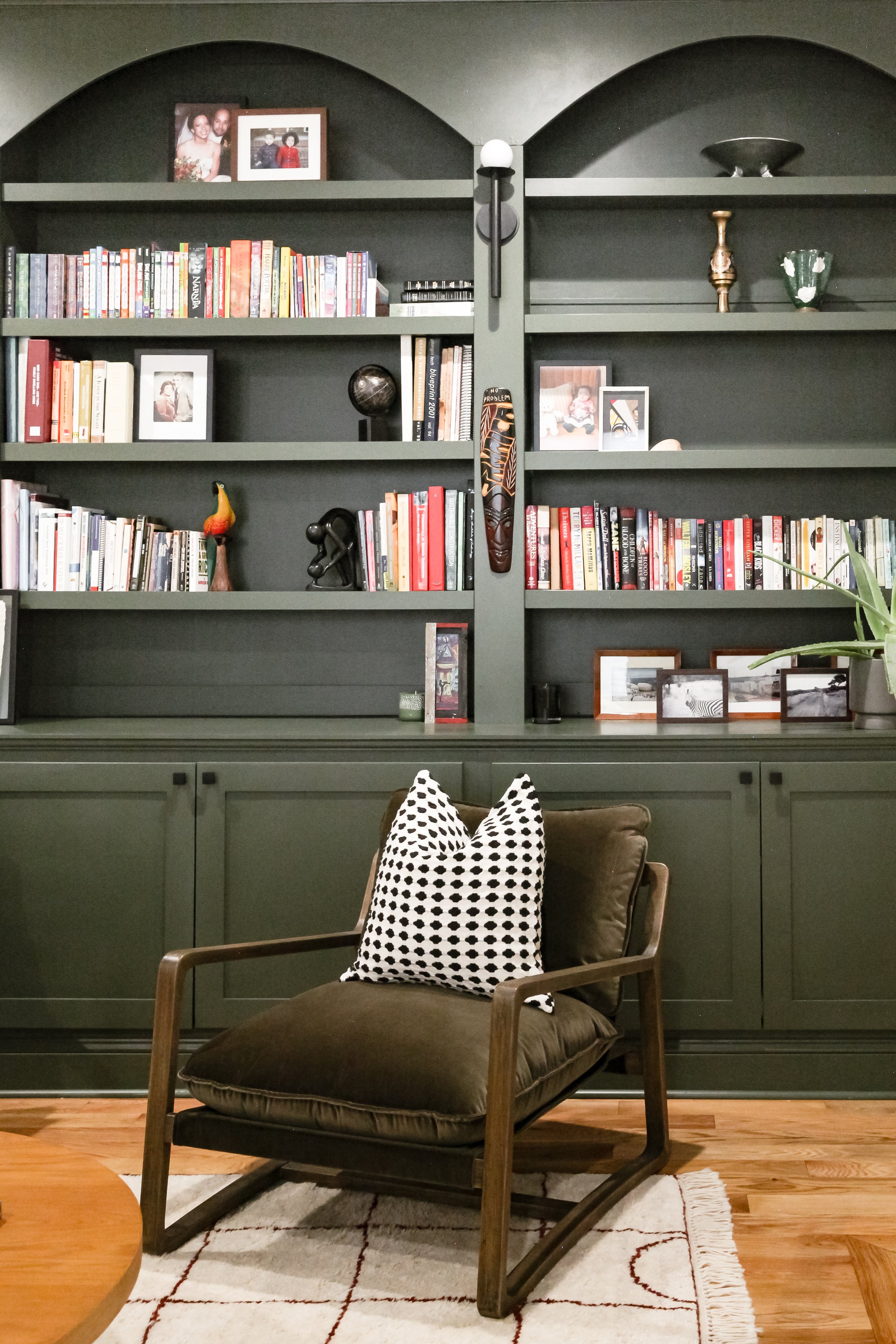
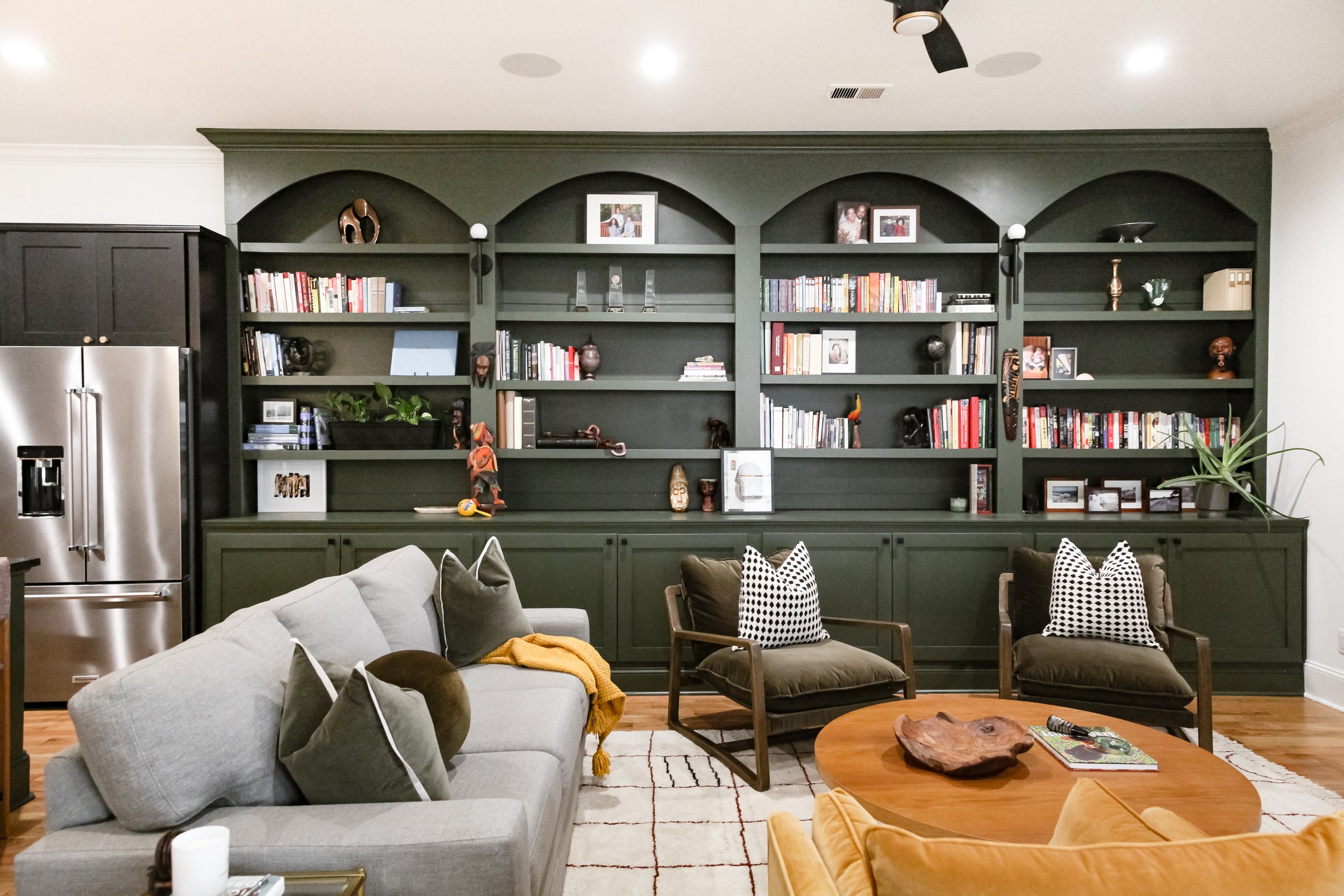
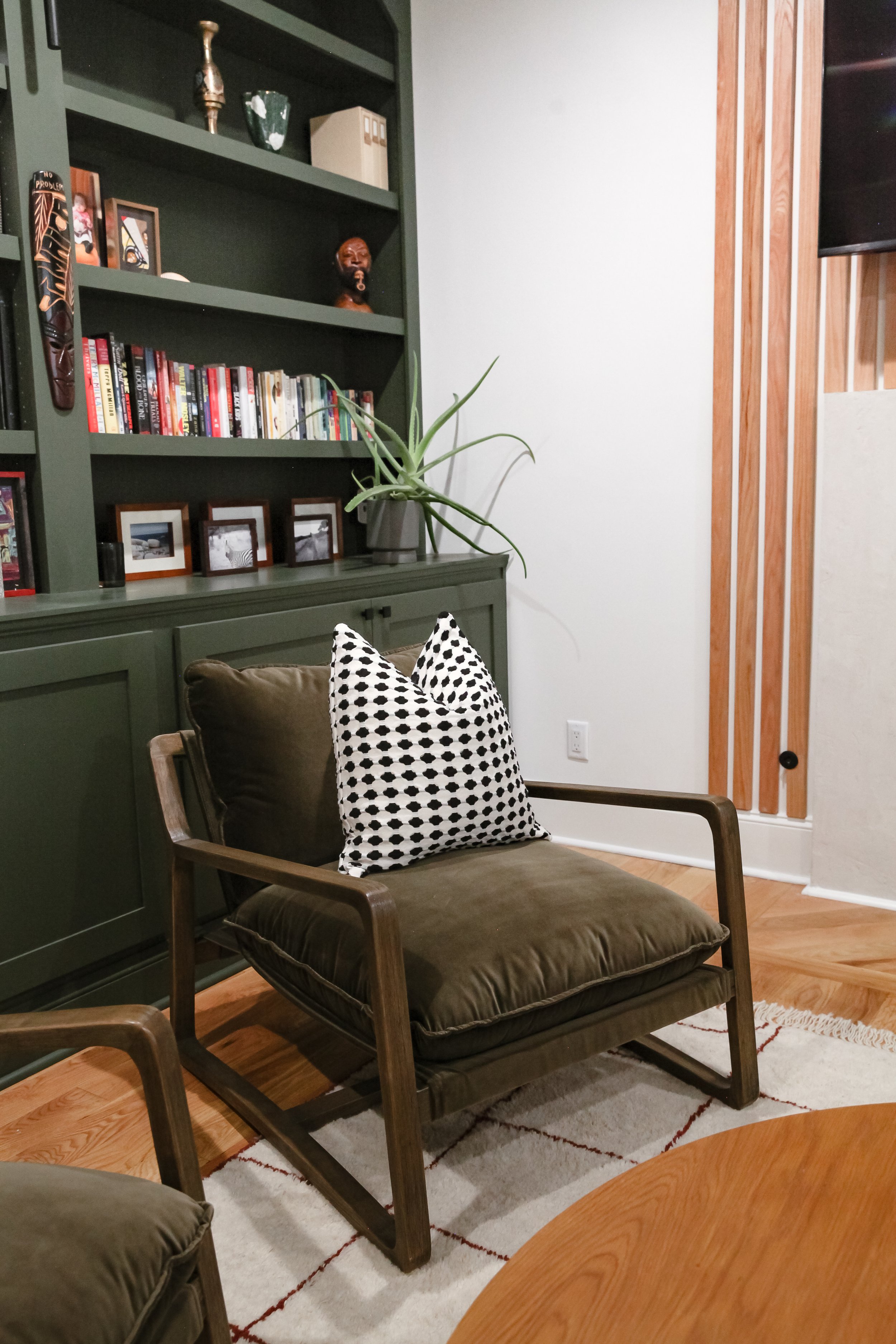
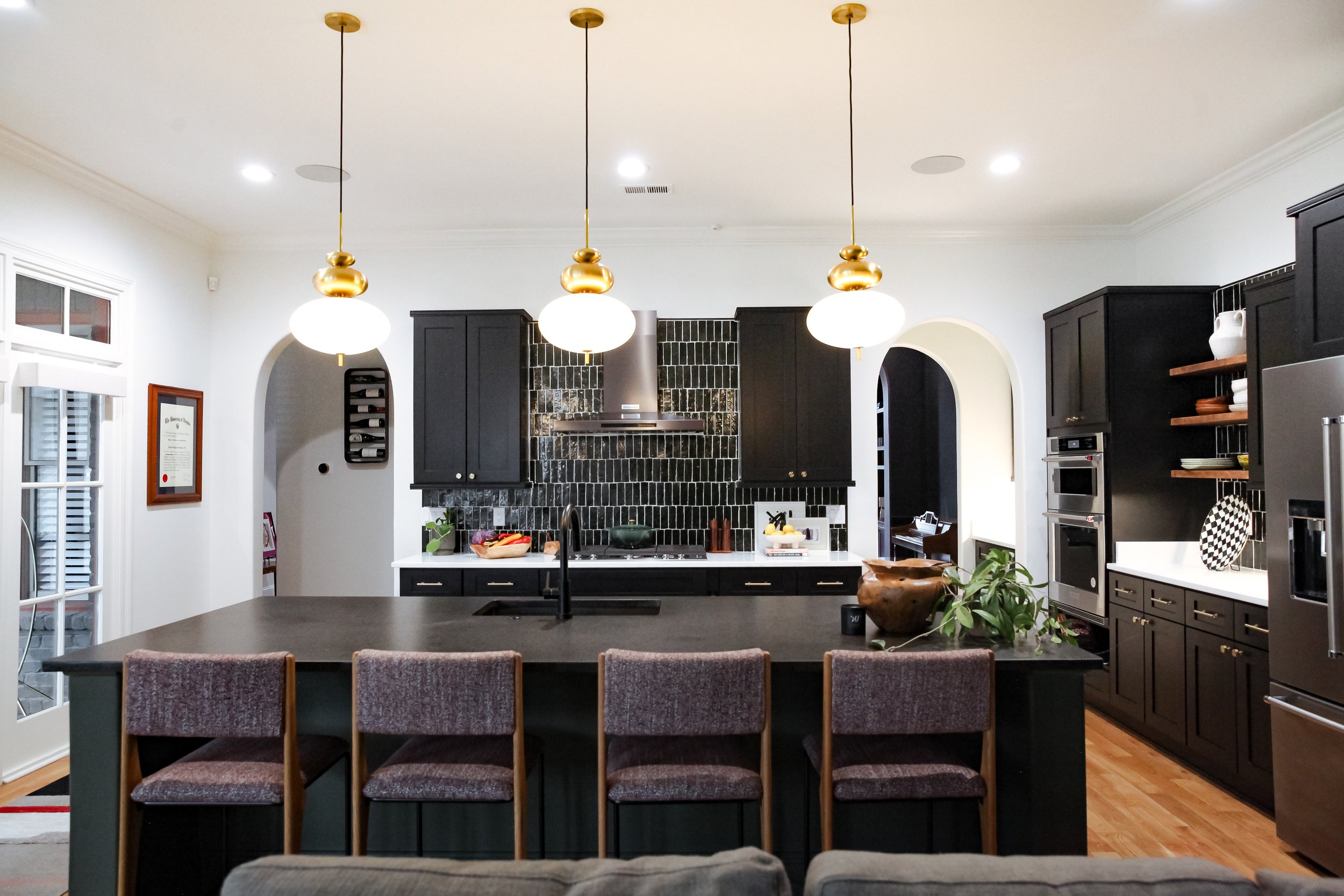
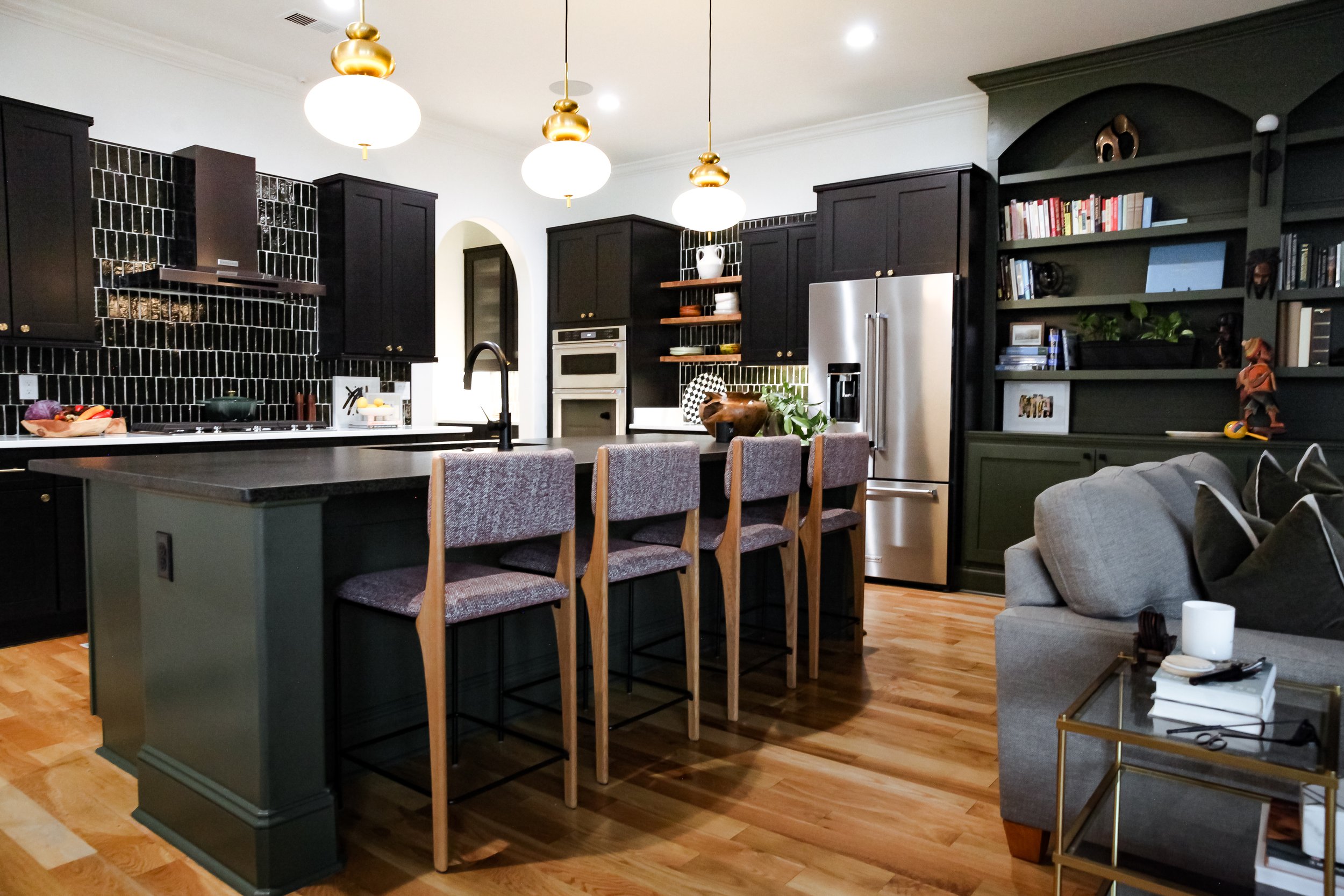
This family room and kitchen combination are just stunning. The overside custom built in bookshelves and custom cabinet fronts created by Humbled Kreations and Adkins Woods are a site to see. You are immediately greeted with them when you first step foot into this space. These custom elements makes this space truly stand out. The family room bookshelves and the kitchen island were painted this deep moody green color to unify the two spaces in this open floor plan.
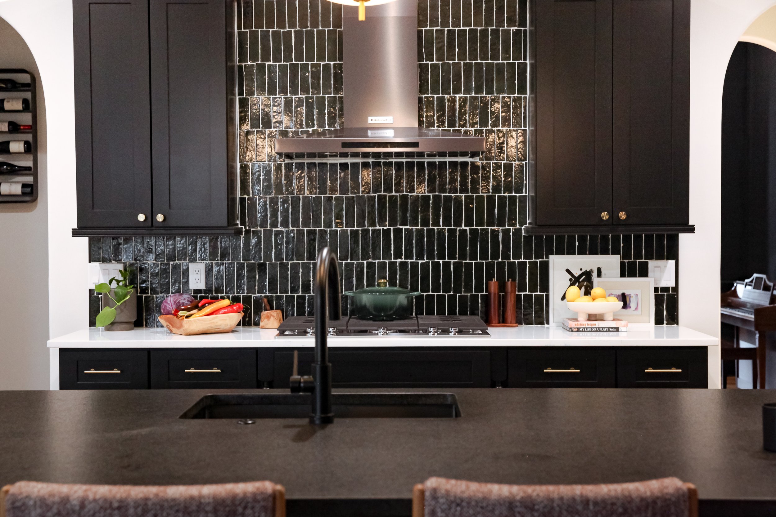
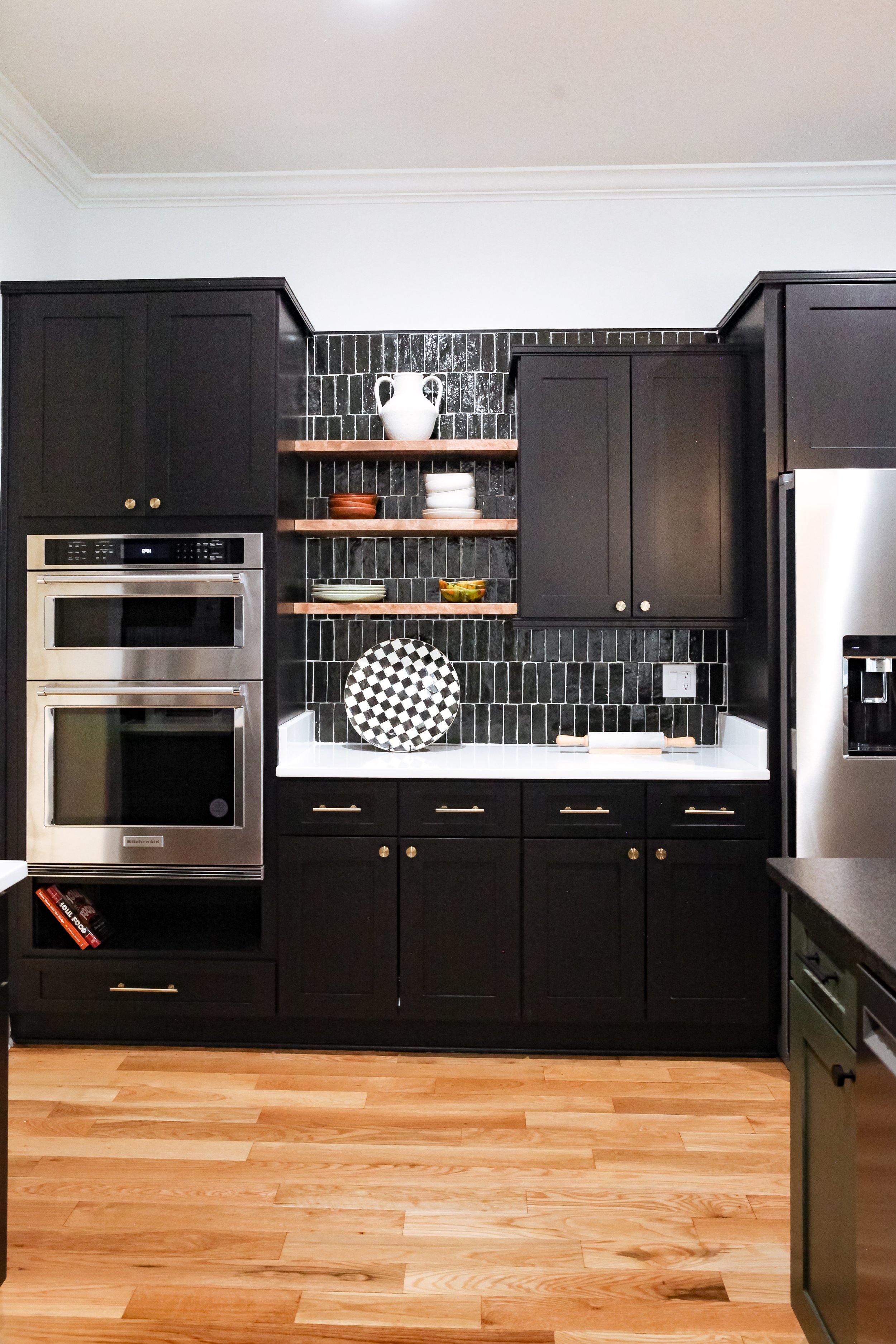
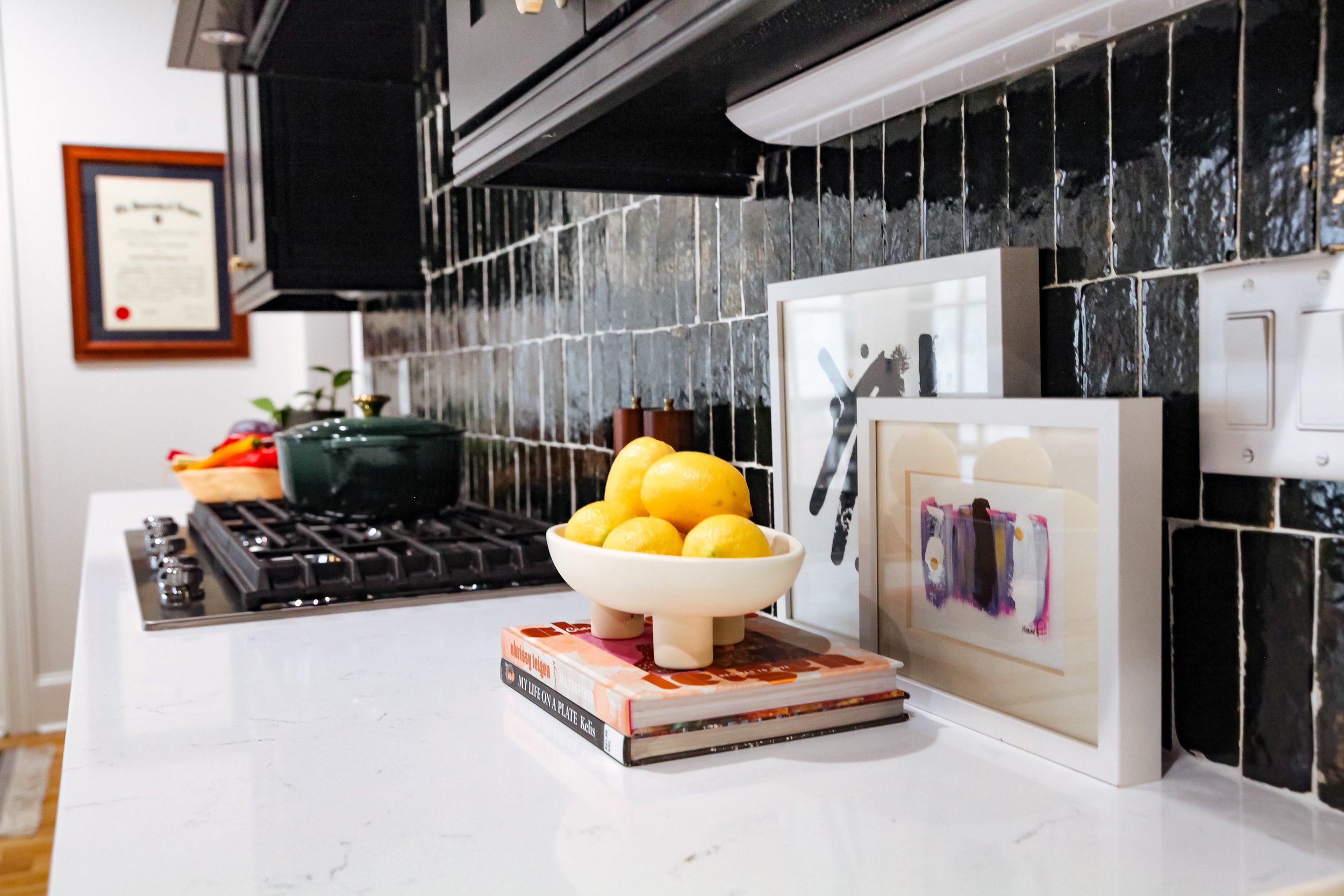
Can we just take a moment for this kitchen tile. Believe it or not, this is not black tile, it is a dark green. We used a lighter grout to make the color show, but pictures don’t do it justice. The glossy tile contrast well with the matte black of the custom cabinets. The kitchen island is oversized, so of course the pendant lights had to be large to balance the two.
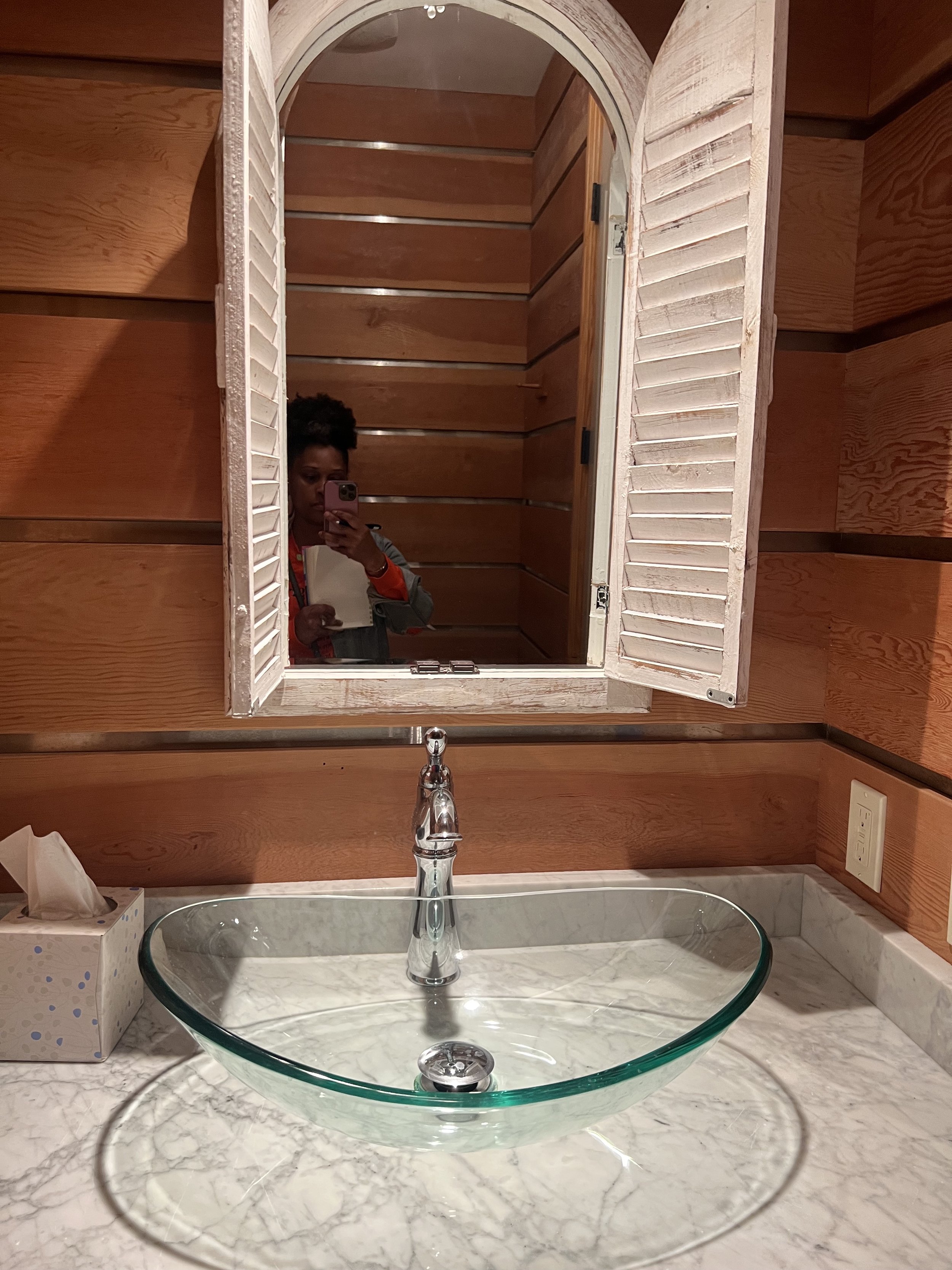
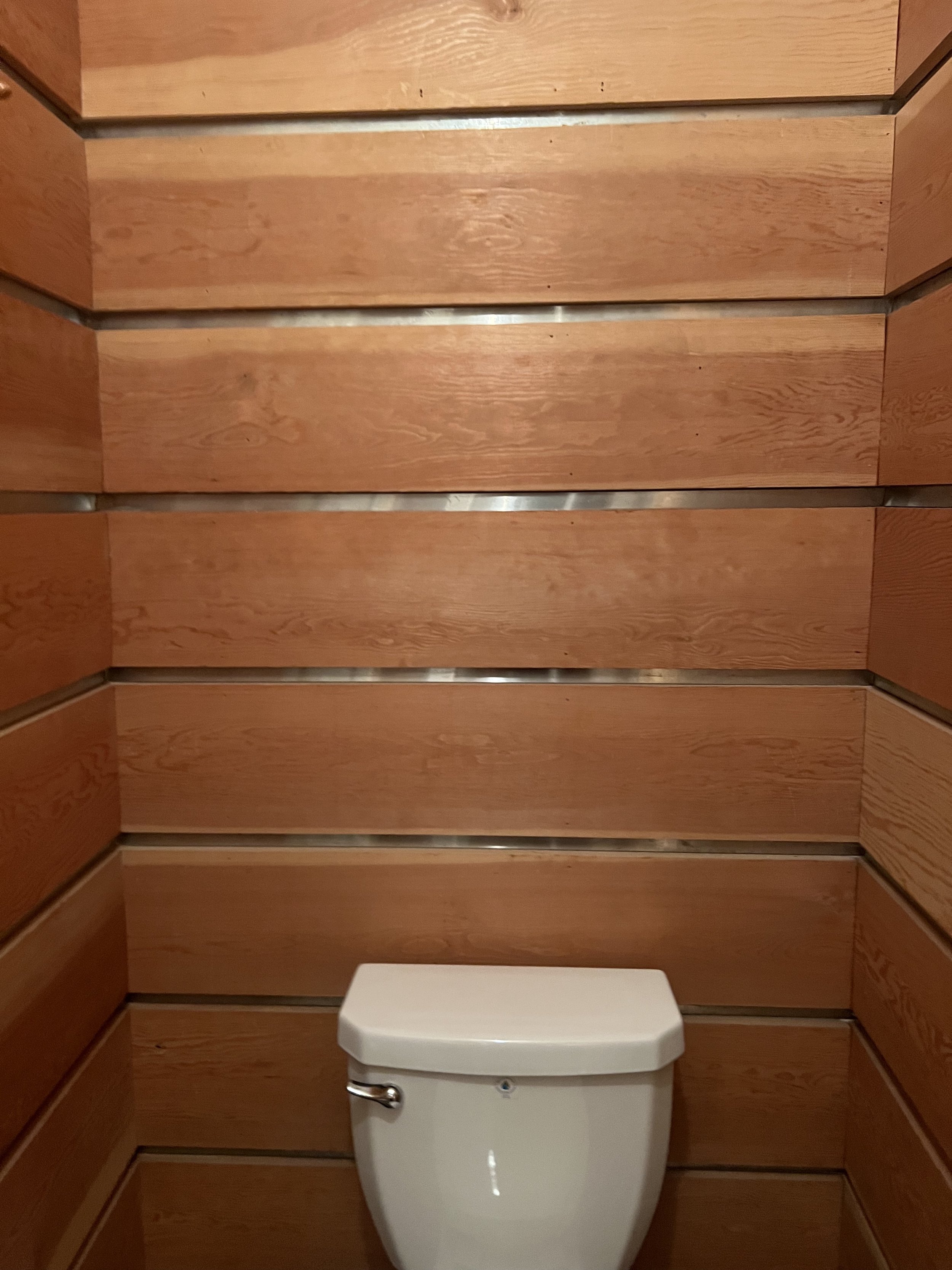
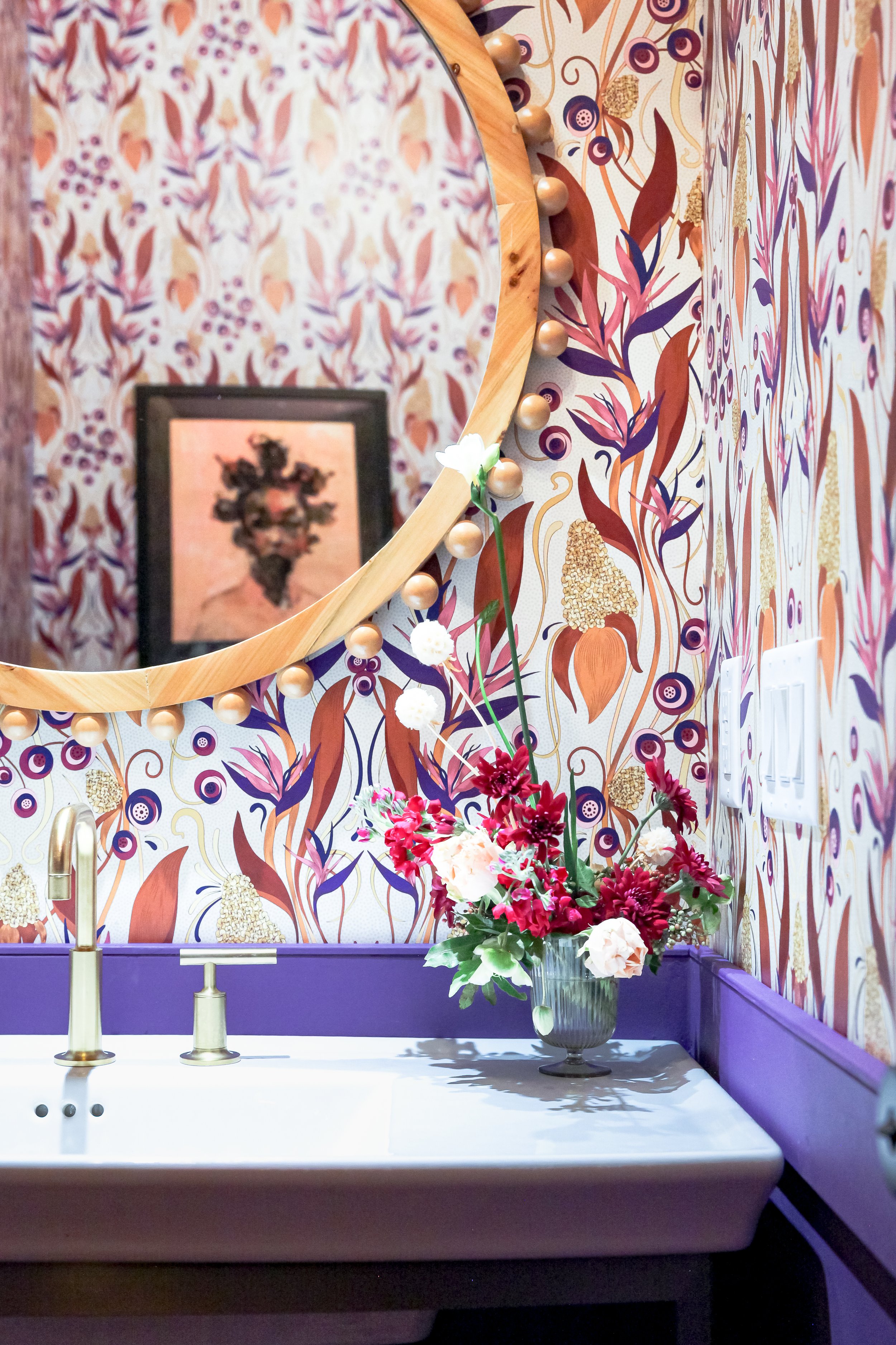
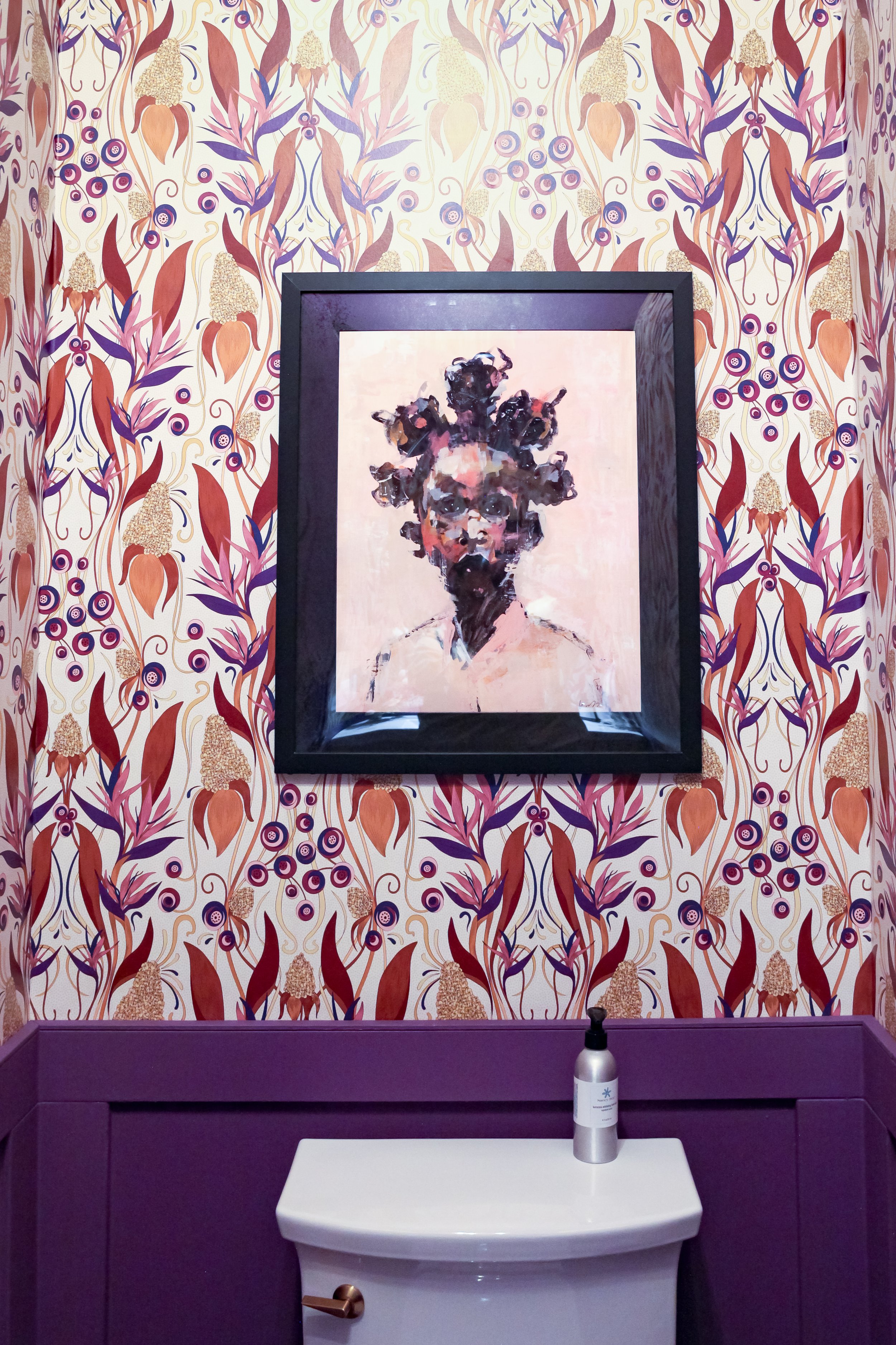
I saved the best for last! Let’s take a look back at the Powder Room shall we. This space really looked like you were stepping in a sauna, but there was no heat or steam coming from this room.
What a transformation if I do say so myself!!
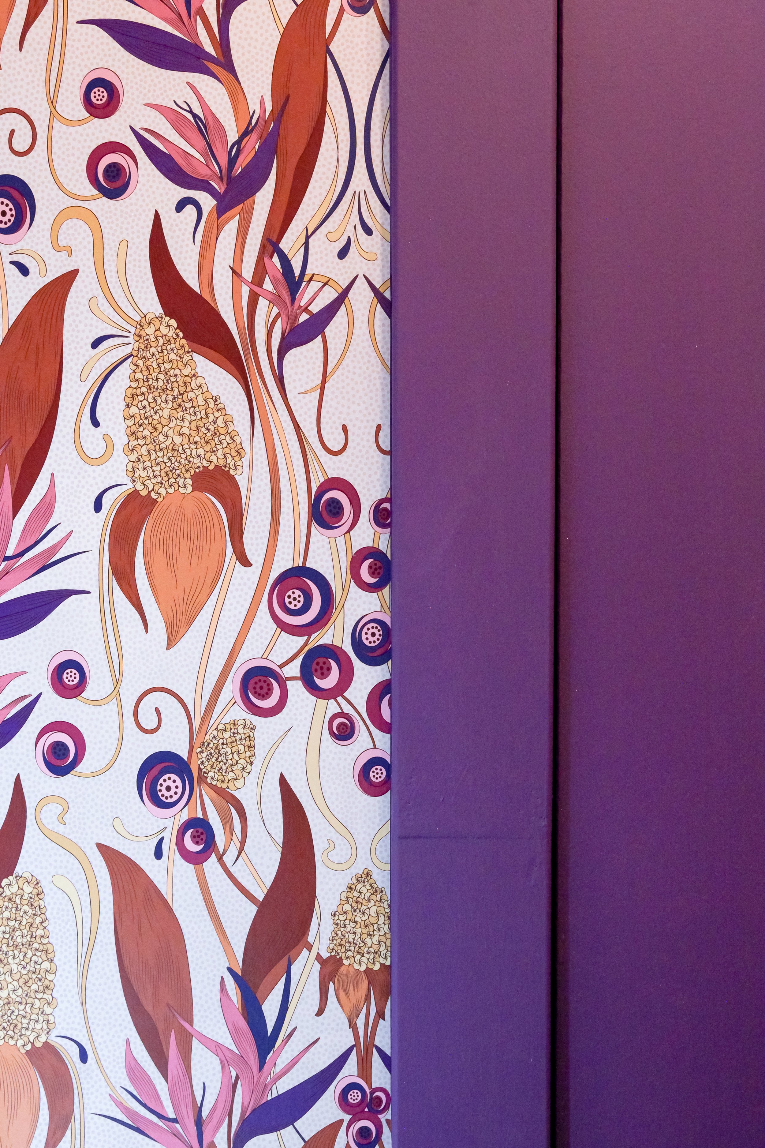
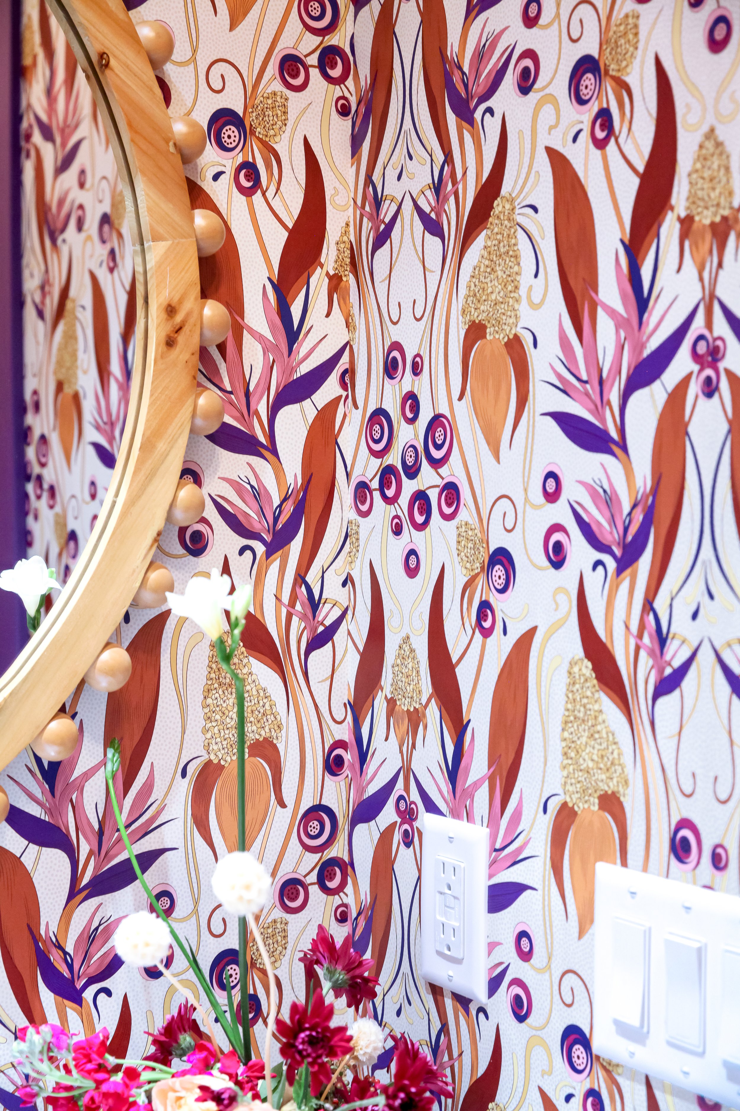
Powder rooms are made to be bold and stand out. When I suggested to my client that I wanted to use wallpaper in this space, her only request was that it had to be by a black wallpaper designer. I told my client, “say less”. I immediately knew I would use my good friend, David Quarles “Ruth” wallpaper that he designed in collaboration with Chasing Paper. It was exactly what we needed to make a statement. The wainscoting, terra-cotta hexagon tile, and the stand alone sink were all a match made in design heaven. Let’s not forget to mention this beautiful rich violet paint color of the wainscoting. The wainscoting added an architectural detail to the space. It now feels modern unlike the wall to wall paneling which made it feel dark and dingy.
Wow, can we say what a transformation.
This project was one for the books. I enjoyed working with James Daniels, Kristin Owens, and Dustin Adkins who worked tirelessly to bring this project to life. I learned so many things about myself, my business, and this entire process that I will take with me into my future projects. It truly was a treat!!
Thank you to my Project Navy Blue clients for trusting me with your home, and Kim Thomas of KPFusion for capturing this space.
Please stay tuned for Part 2 coming any day now.


