Guest Bathroom Boldness
The guest bathroom makeover has come to an end. Even though I did a mini refresh of the space a couple of years ago, this space now just feels so right. The mini refresh made the space nice enough to have guests to use it, but something was always missing.
It was missing boldness, but before I break it all down, let’s revisit its past.
The bathroom lacked pizazz. Simply put it was just a white box that was void of anything that was interesting except for the black cabinets and hardware. The white box for this space even though it freshen up the space still left a lot to the imagination. I often dreamed of what this space could be until I turned that dream into a reality.
Even the light switch and outlet got some love in the newest makeover. You can clearly see that the old outlet and switch was plastic and outdated. I wanted to bring in more up to date and modern switches and outlet.
The mini refresh consisted of painting the bathroom white, painting the bathroom cabinets black, changing out the hardware, updating the light and faucet. I also added a towel bar and picture ledges. I added some greenery and a new rug. Even though, it was decent enough for our guests, it was just boring. I was ready to change that and add some flair to the bathroom. I love spaces that you walk into and it makes you want to be in there.
We added a new faucet, picture ledges, hardware, and a new vanity light. The space was better than before, but it still lacked character. It definitely needed something bold and graphic.
The picture ledges were added to bring in some more styling to the area, but it was just put over a boring white wall. Something was definitely not adding up. It allowed me to do something besides the tradition picture over the toilet. For this space, I wanted to added more so I decided on the ledges. However, the white walls wasn’t allowing the ledges to shine.
First order of business was to bring in this Gestural Abstraction bold and graphic wallpaper. I wrapped the entire room in this wallpaper and it has made all the difference. I chose this wallpaper for its boldness and unique graphics. I knew when refreshing this space that black, white, and gold are the color story that I wanted to tell. I had previously painted the cabinets, and I wanted the paper to be its backdrop.
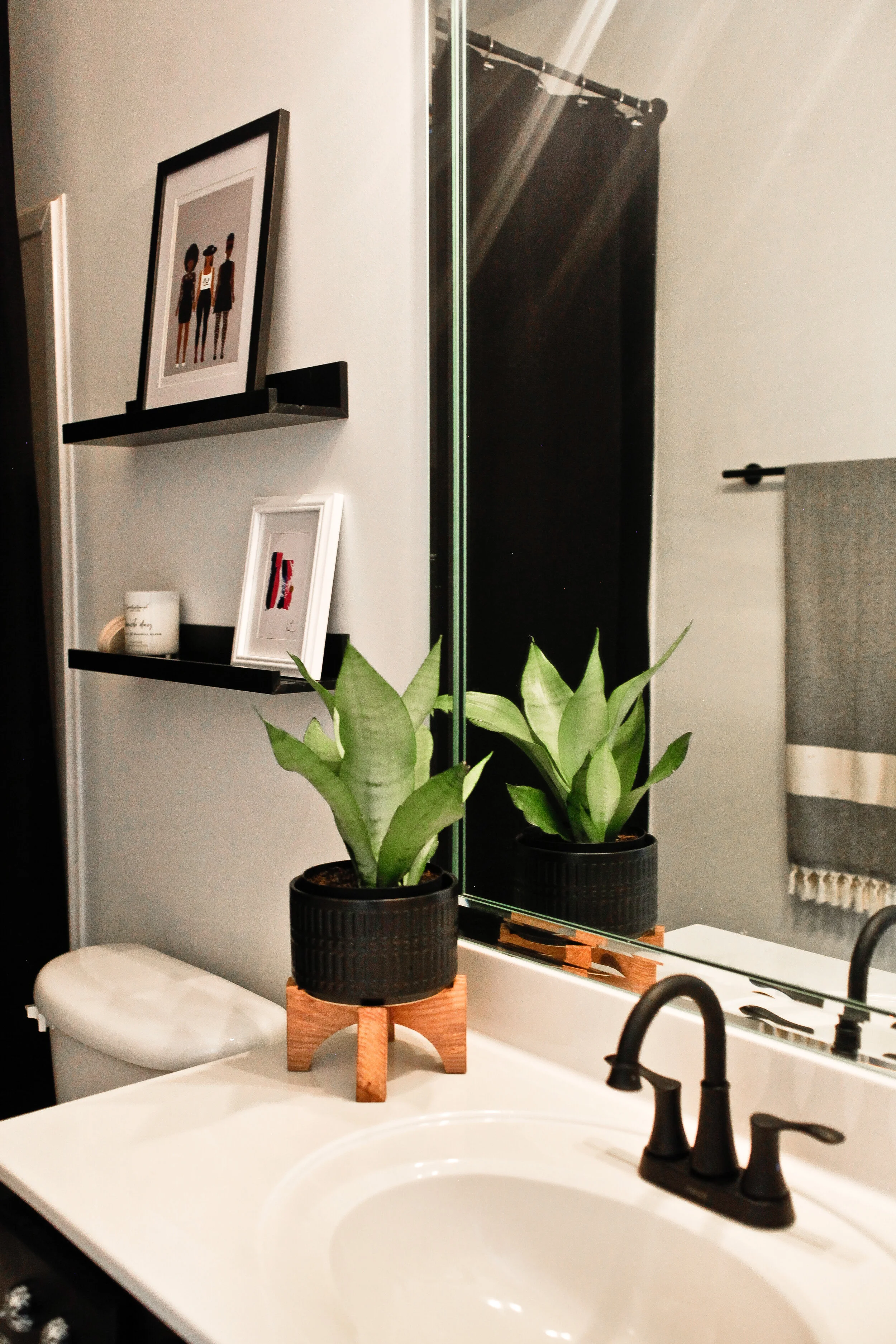
I brought the picture ledges back in to style up the space. A space isn’t complete without some styling. Here I brought in artwork, a crystal, home decor pieces, coffee table books, and bath essentials. The coffee table books act as art just as much as a painting.
Every bathroom needs soap and lotion that is easily accessible. Instead of putting these items by themselves, I decided to make a moment out of it. Here the dispensers are styled with a candle, candle cutter, scents, and a marble tray.
No space that I design is complete without artwork and greenery. I completed styling with artwork by one of my favorite artist Monica Lewis. I layered two pieces of her artwork on the vanity and then placed this beautiful green plant in front of it.
These velvet curtains were perfect to bring in some texture and additional height to the space. I love using window curtains because you can get them in a variety of colors, textures, and sizes. The typical shower curtains are traditionally short and there aren’t many patterns to choose from. I brought in this Athropologie tub caddy to house my Buff City Soap self care items and a magazine. This is the perfect set up for relaxing.
Since there was a towel bar here, I wanted to bring in another pattern. I was able to do that with this Turkish towel that I draped to one side of the bar. I didn’t want to cover up too much of the wallpaper. This was able to give the mixed prints that I wanted without taking away from the wallpaper.
As you can see this guest bathroom definitely got some boldness to it and now it is a place that I’m happy to show off.
Please check out the details below.
Turkish Towel
Thank you for following along and please stay tuned for more!!


